PORTFOLIO
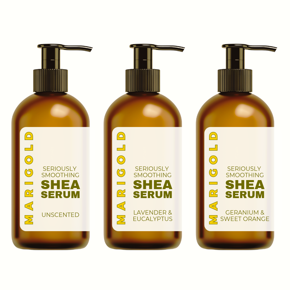
Branding: Marigold
Project title: Marigold Full Brand Identity
The ask: Marigold makes one high quality product, and wanted a brand that felt as simple and considered as the product itself.
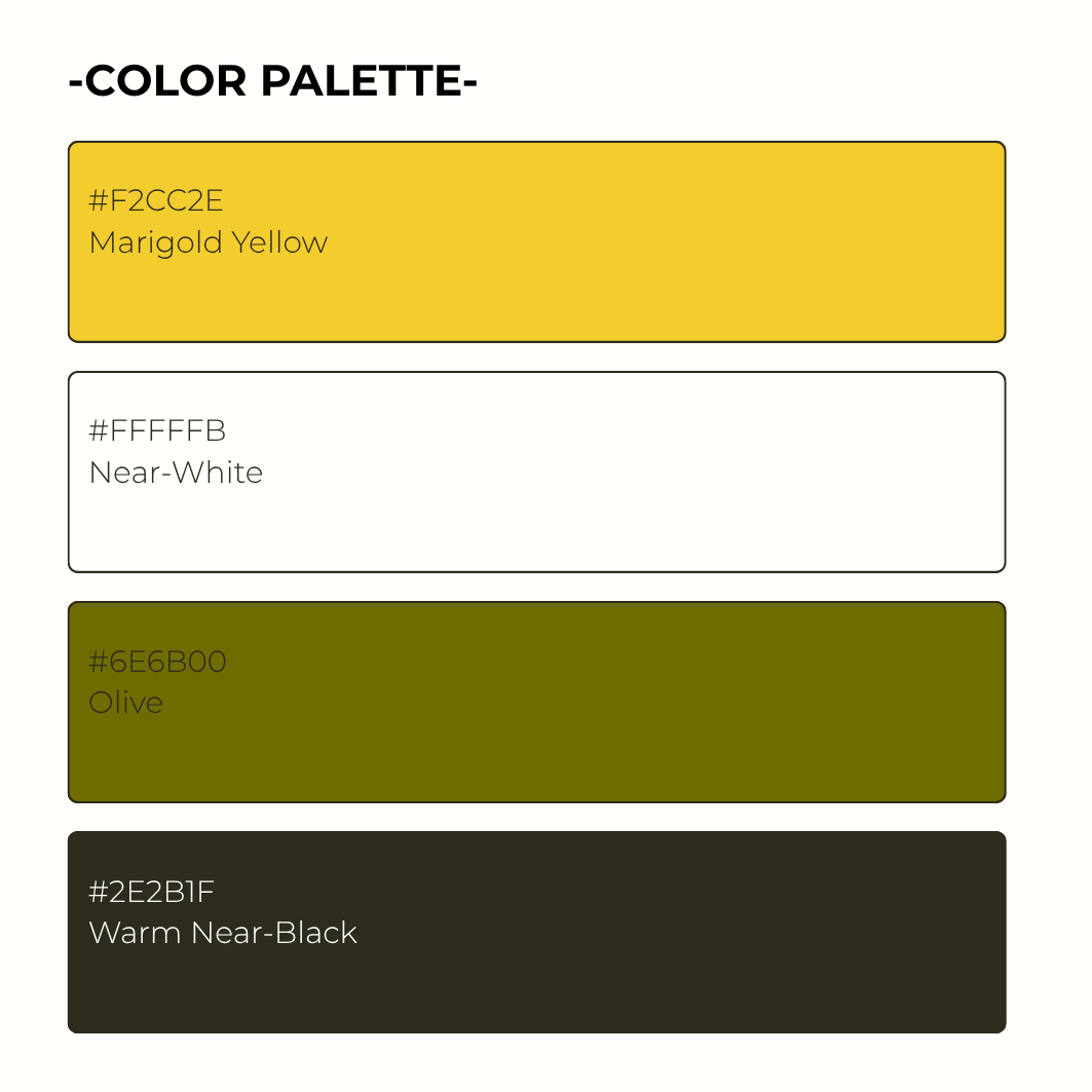
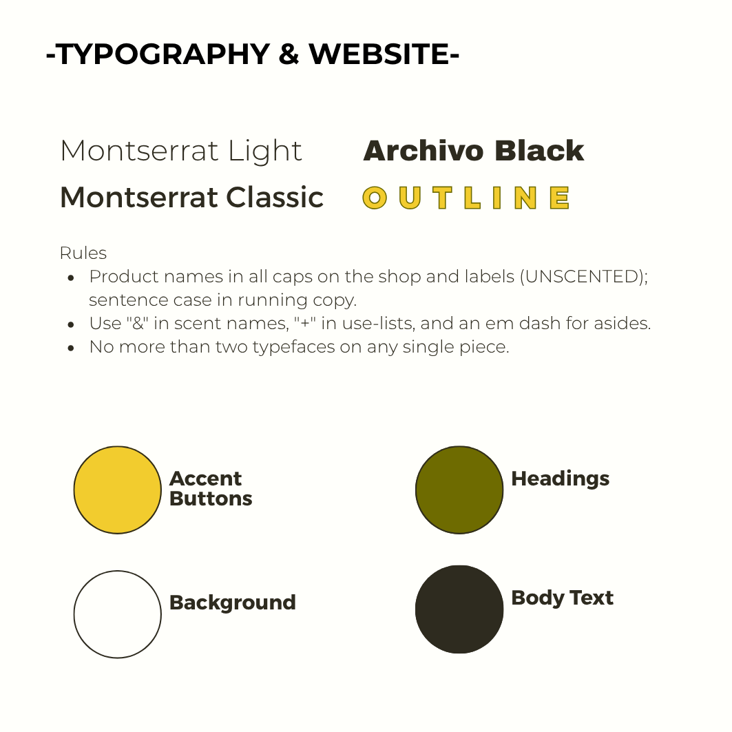
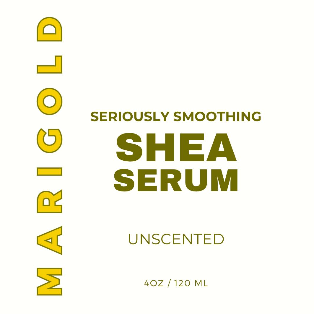
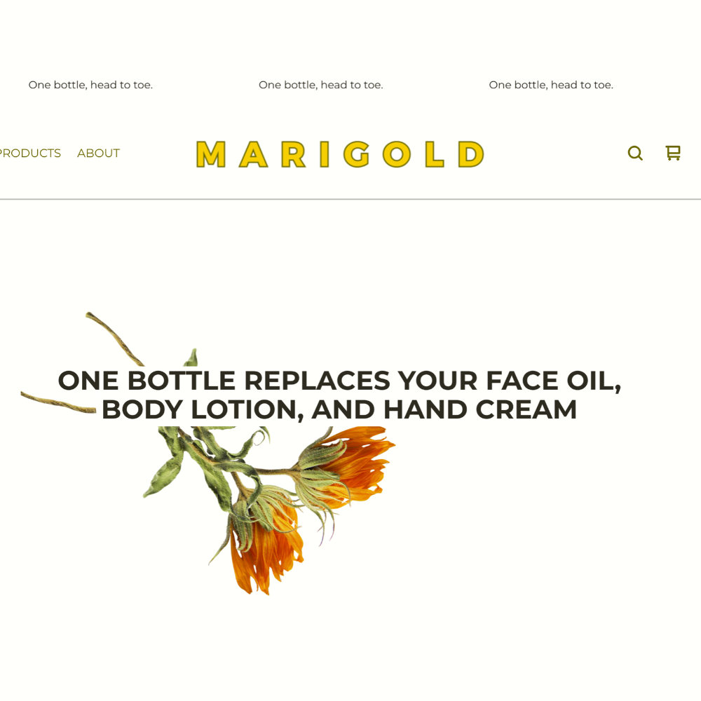
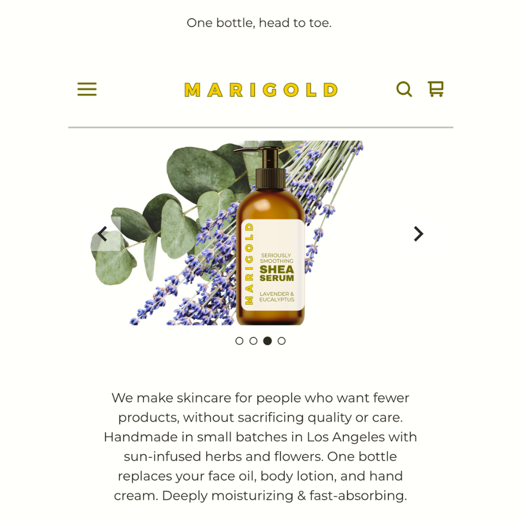
What I did: Designed the logo, chose the color palette and typography, and carried that system through product labels, web images, and the site itself. Nothing was left to feel like an afterthought; the goal was a brand that looked like one decision, made consistently, rather than a hundred small ones made separately.
The result: A cohesive identity where the label, the website, and the product photography all read as the same brand at a glance: clean, botanical & elegant. This project shows that branding is not just a logo, but a system.
Email Marketing:
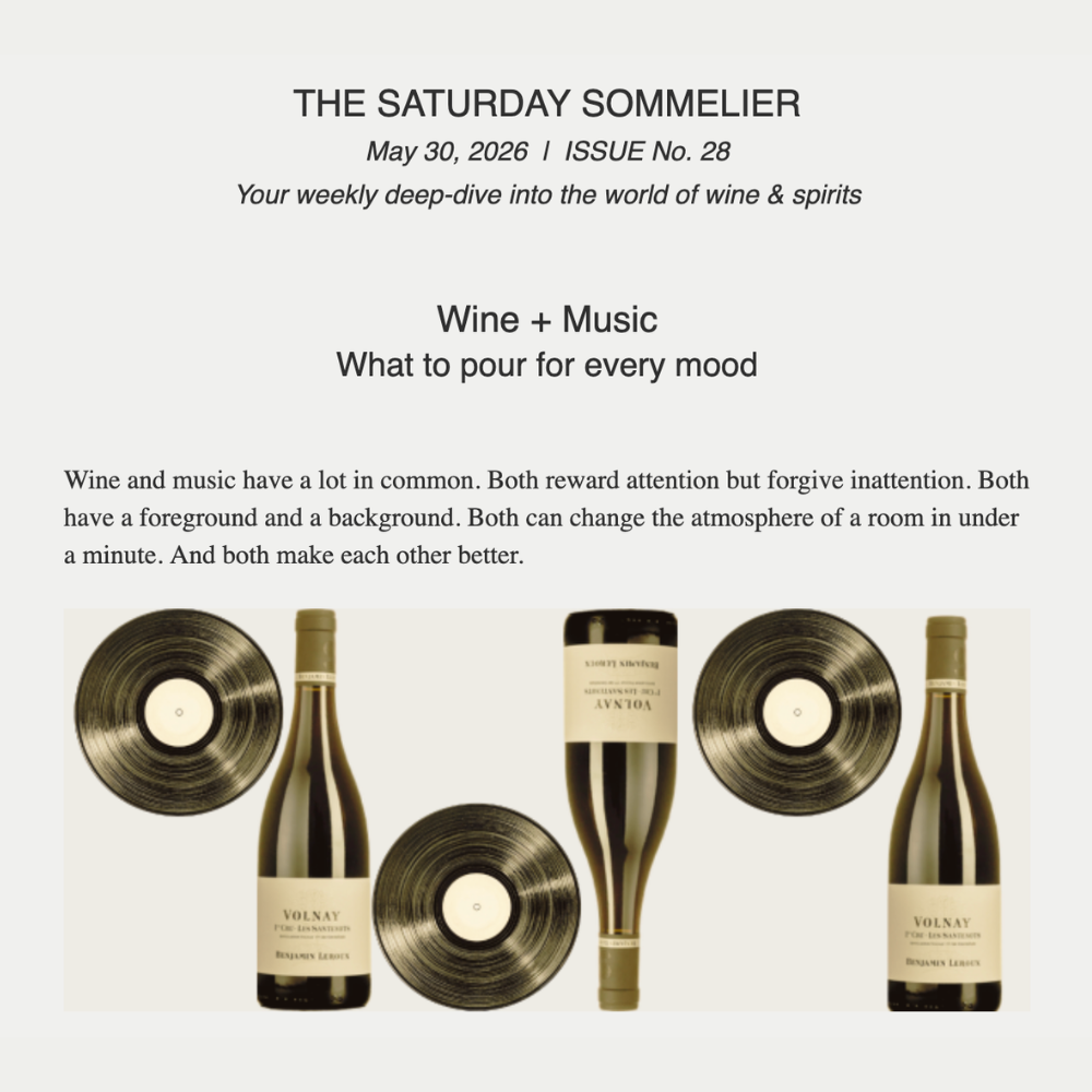
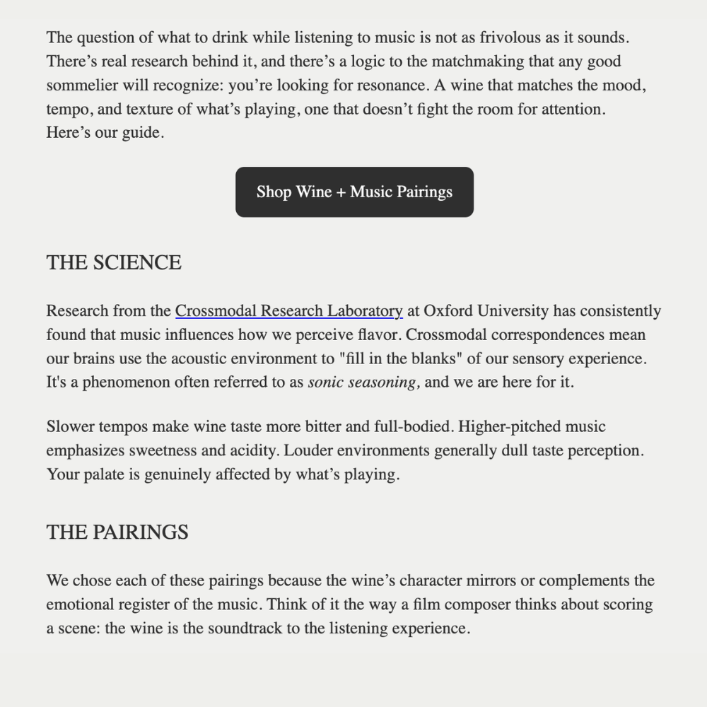
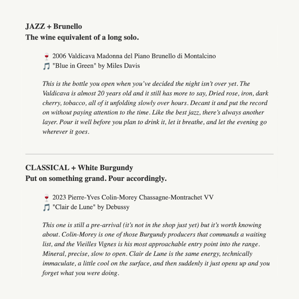
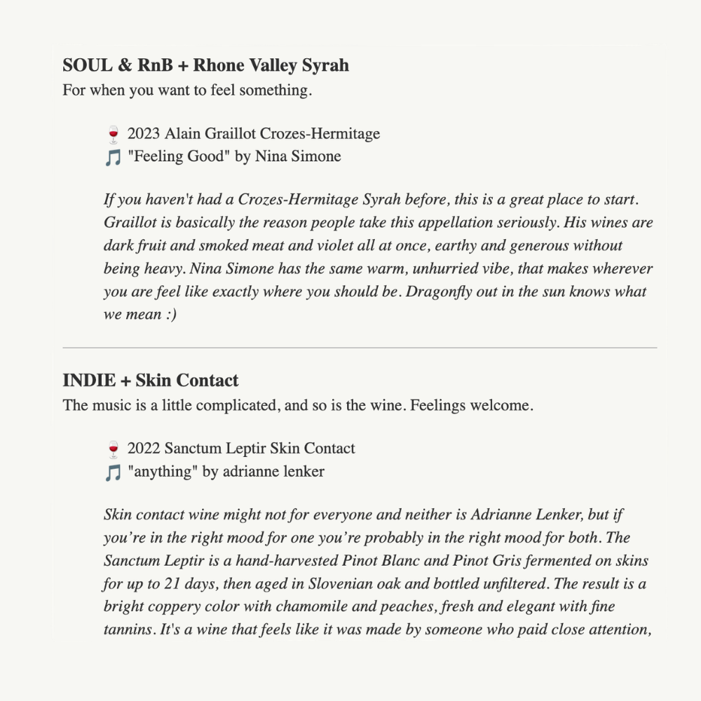
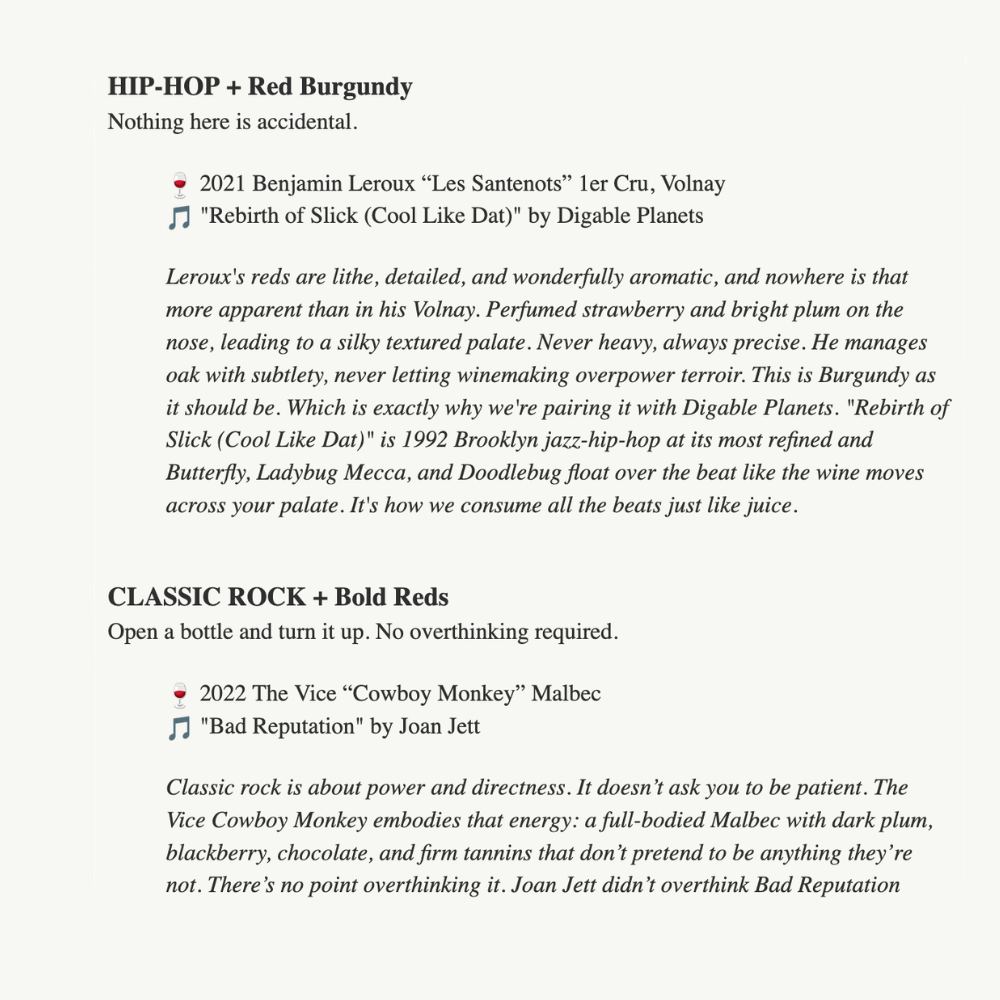
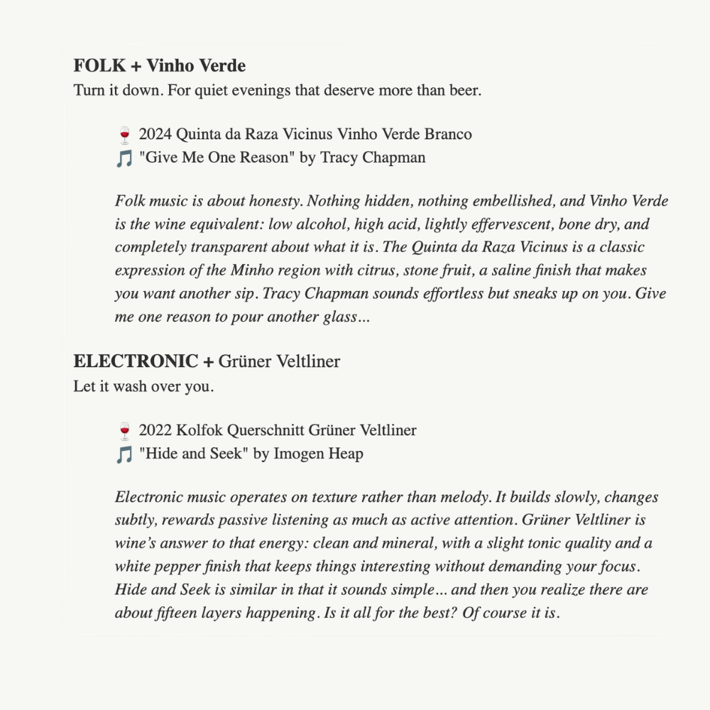
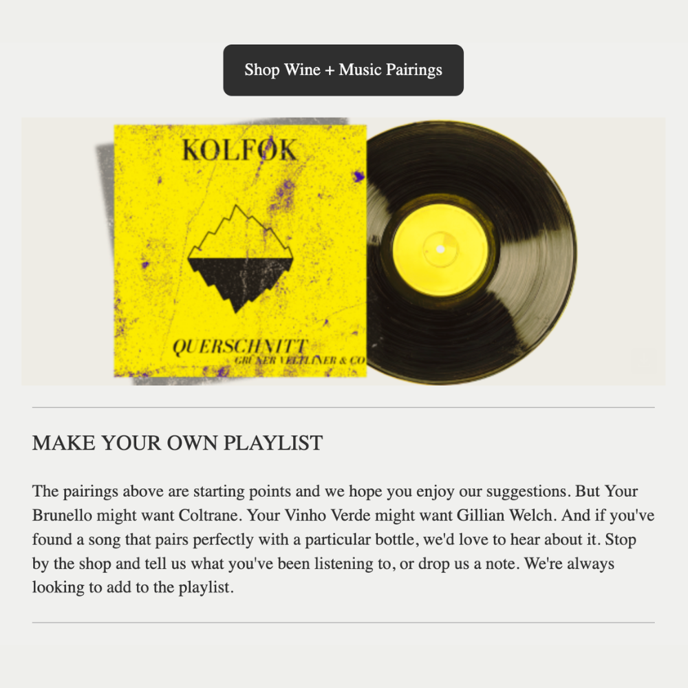
The Saturday Sommelier
Project title: "The Saturday Sommelier" Weekly Newsletter
The ask: A weekly newsletter that engaged wine customers between purchases - a long-form educational read clients would look forward to opening.
What I did: Built a recurring format around deep-dive storytelling with a consistent structure designed to build a habit. Each newsletter ties directly into specific bottles, turning the content itself into the sales mechanism, without ever feeling like a hard sell.
The result: A newsletter that both entertains and converts, in a voice that's knowledgeable without being stuffy. Email marketing at its best: not just writing well, but building something people come back for.
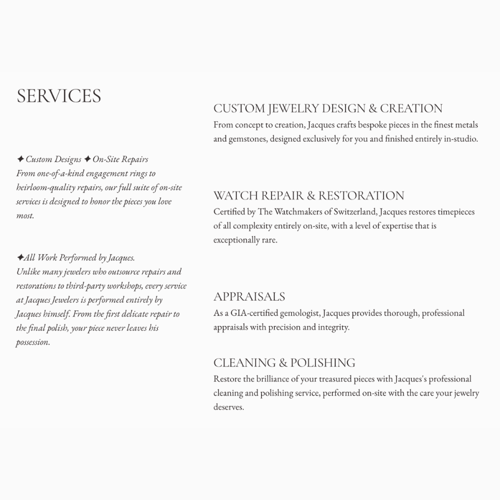
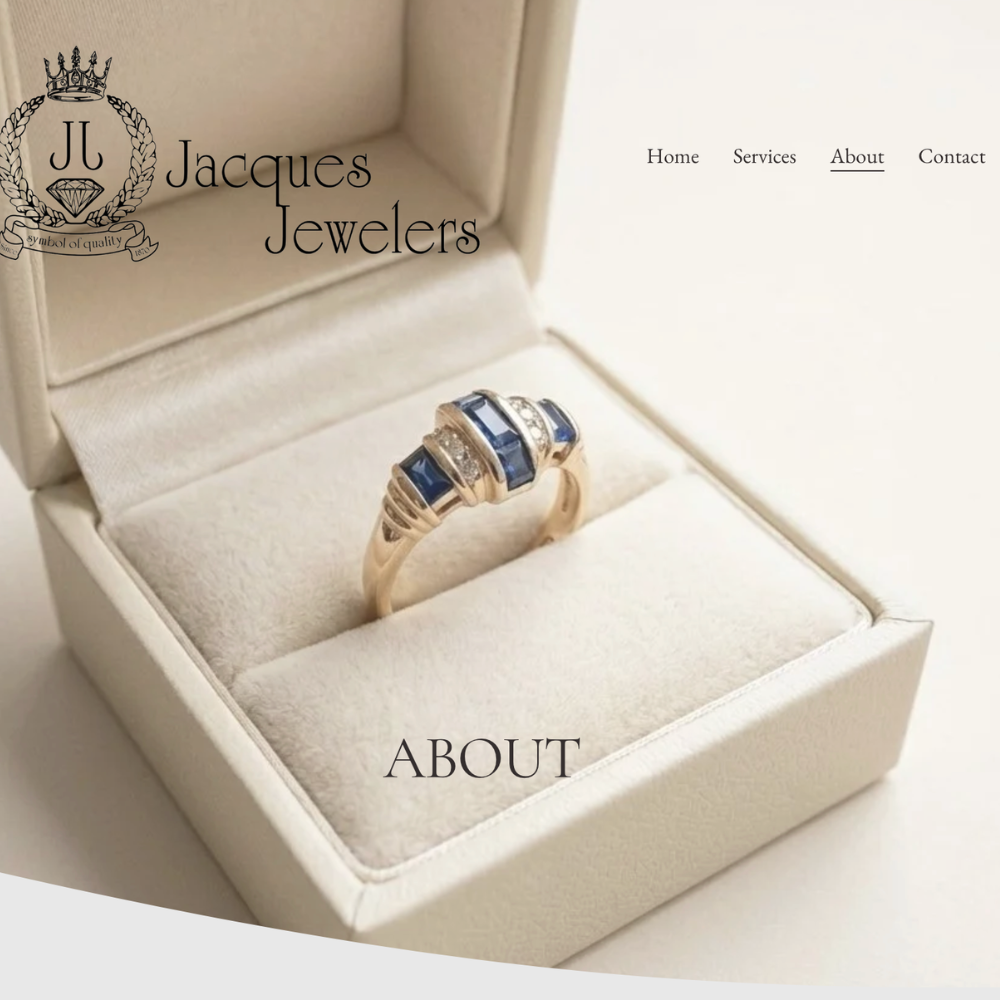
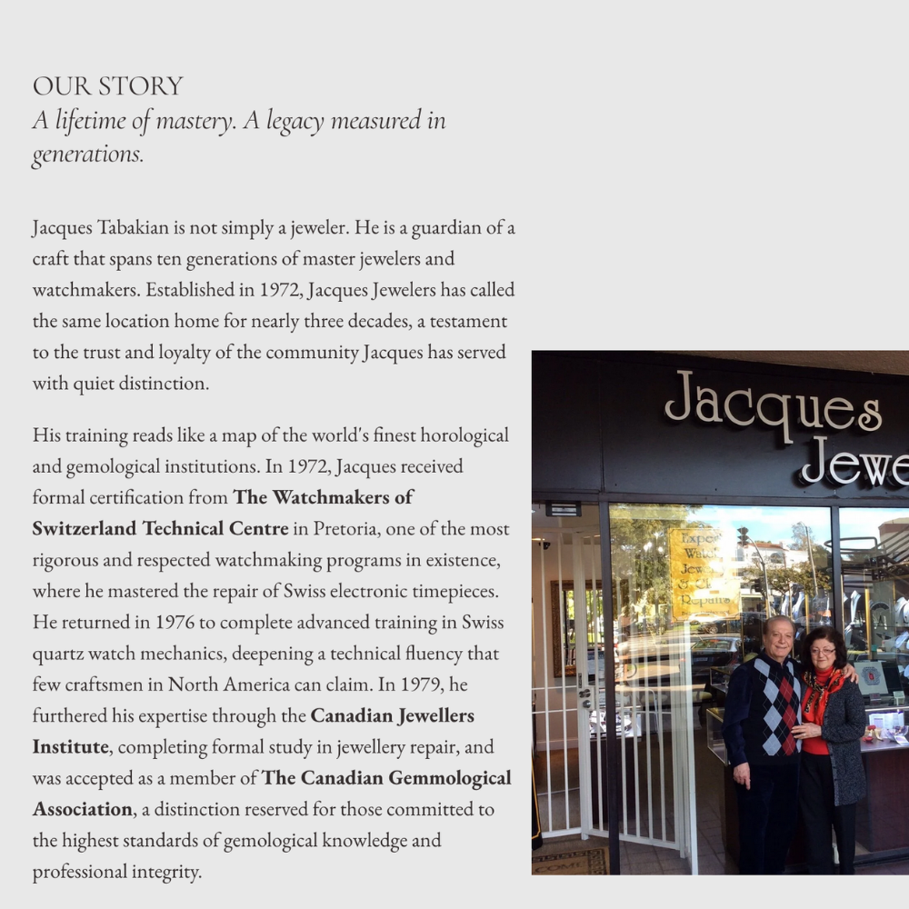
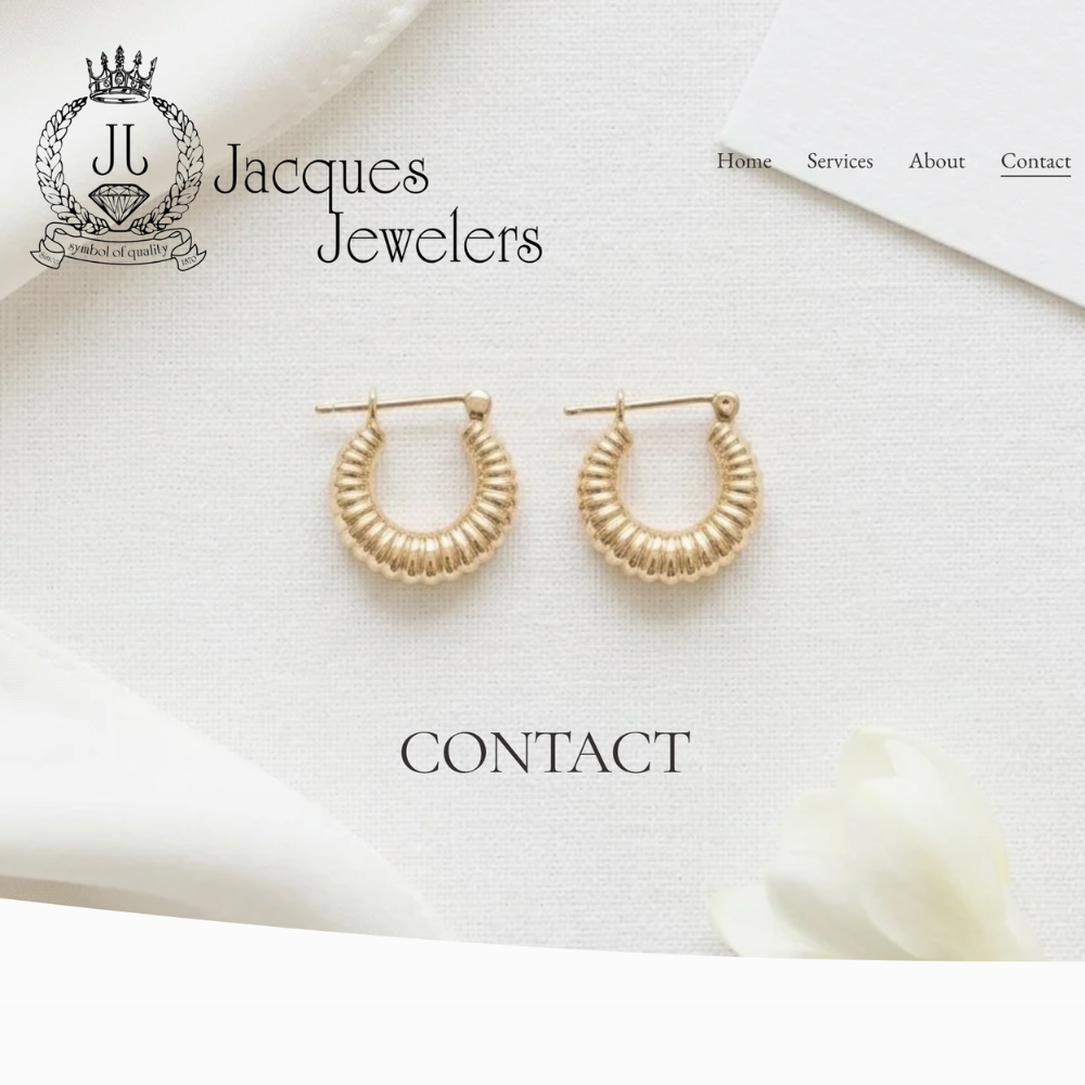
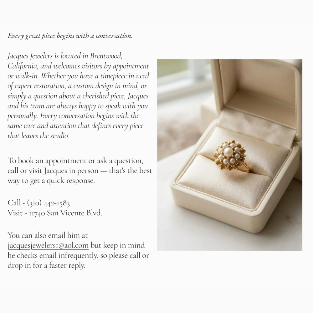
Website Refresh & Copywriting: Jacques Jewelers
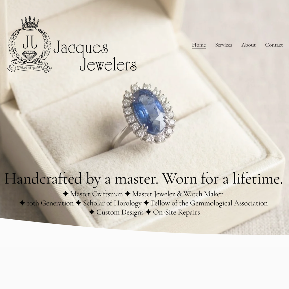
Project title: Jacques Jewelers Website Copy & Brand Voice
The ask: Jacques Jewelers needed copy that matched the caliber of his work (a tenth-generation master jeweler and watchmaker) without feeling stiff or old-fashioned.
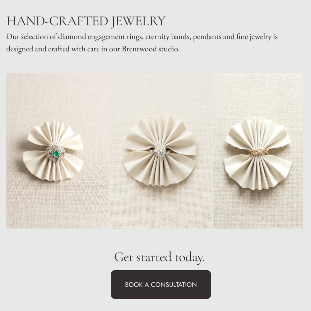
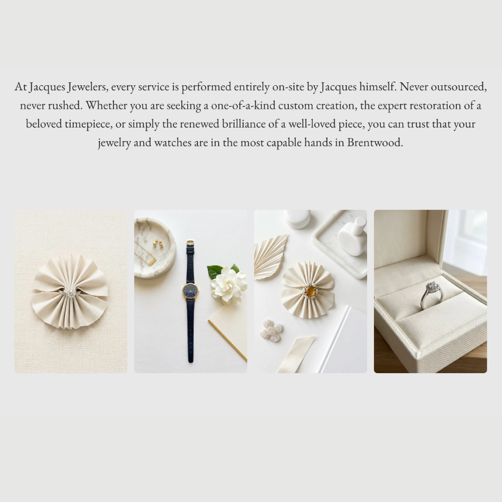
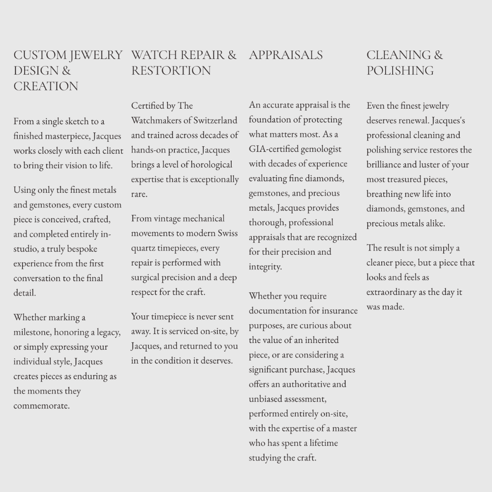
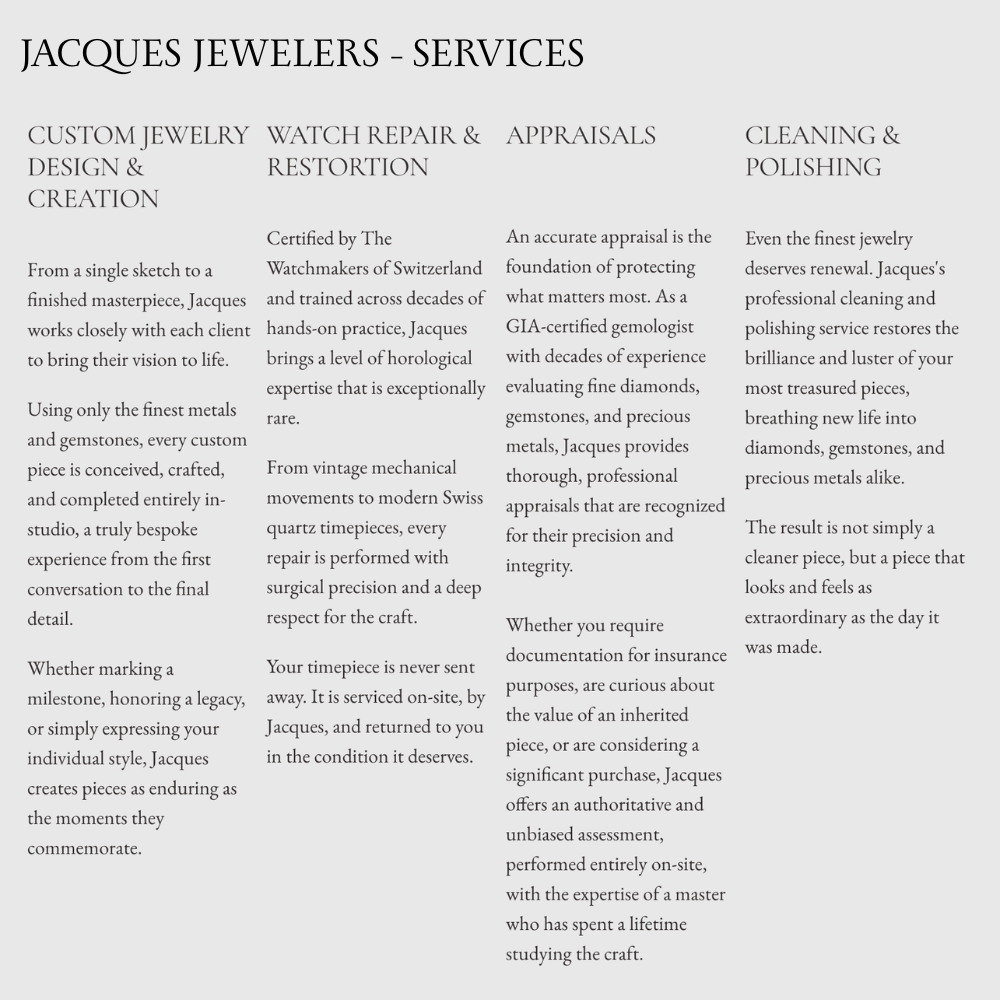
What I did: Rewrote the site copy to lead with Jacques's credentials (Swiss watchmaking certification, GIA gemologist, ten generations of family craft) in a voice that feels aspirational rather than dry, added new service pages to reflect the full scope of his work, and shot and edited the product photography myself.
The result: A site that makes "master craftsman" feel like a unique distinction. Walk-ins increased by 10% after launch.
Graphic Design
Project title: Various materials for print and digital promotions
The ask: Weekly events, private events, new services, and product launches all need materials that get noticed fast, explain the offer clearly, and look unmistakably like the brand.
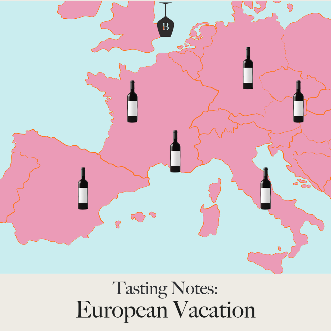
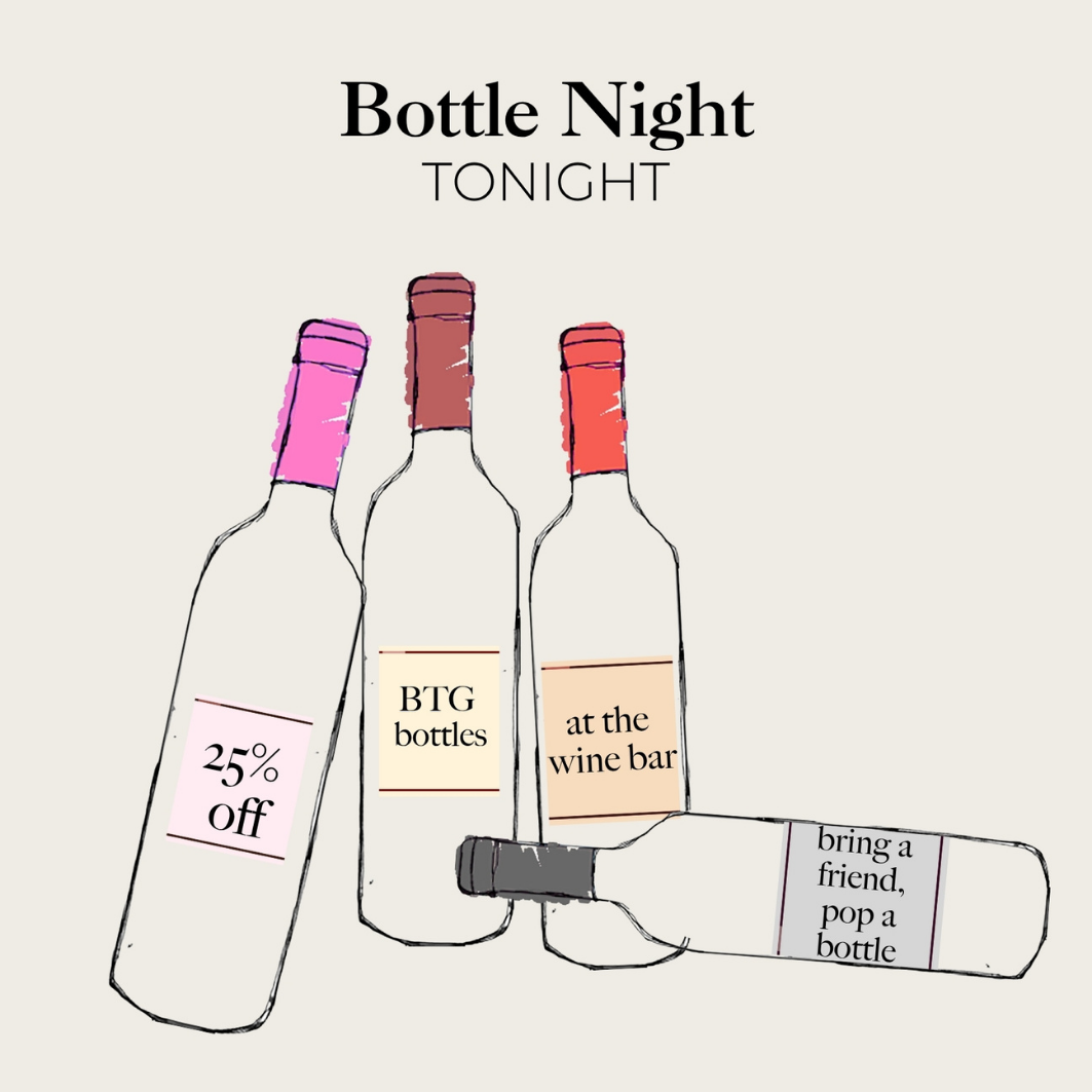
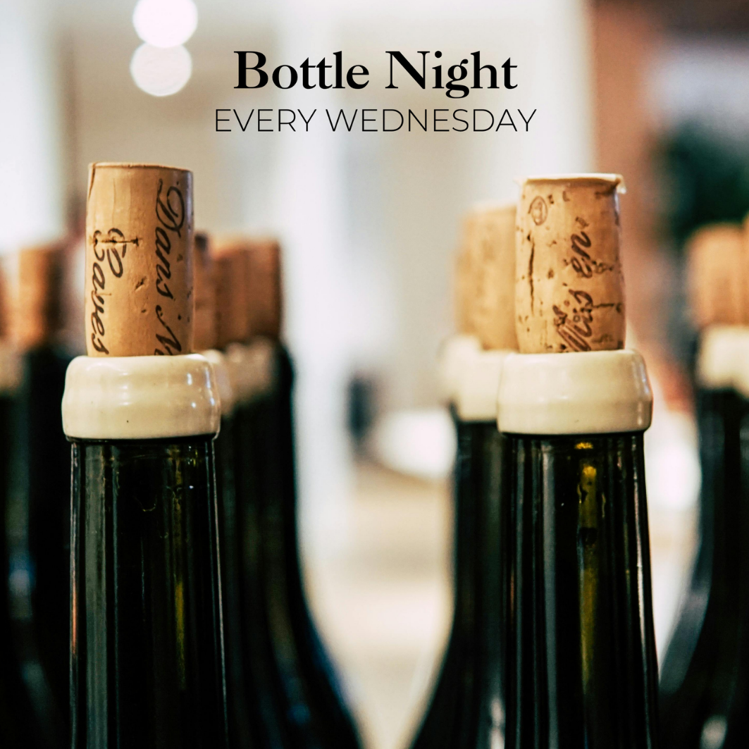
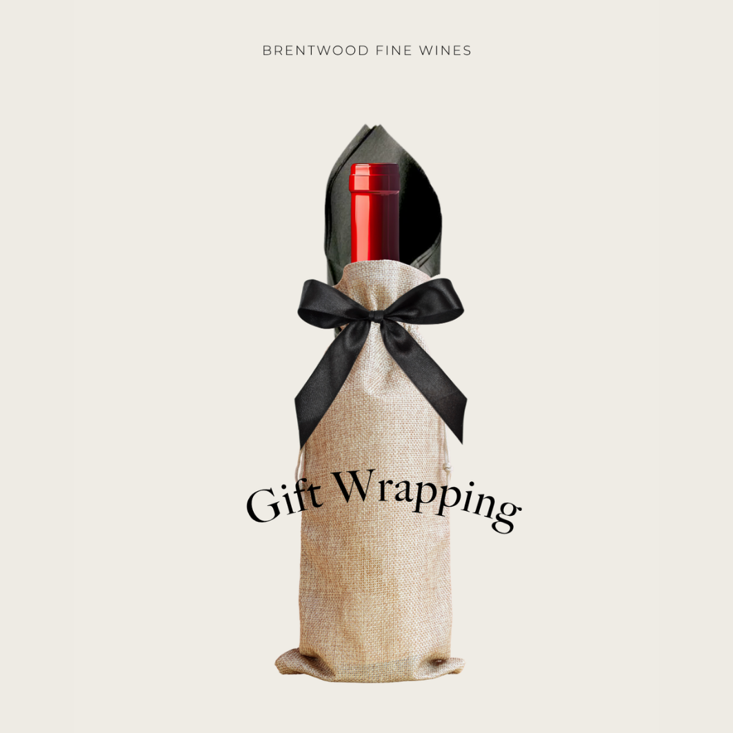
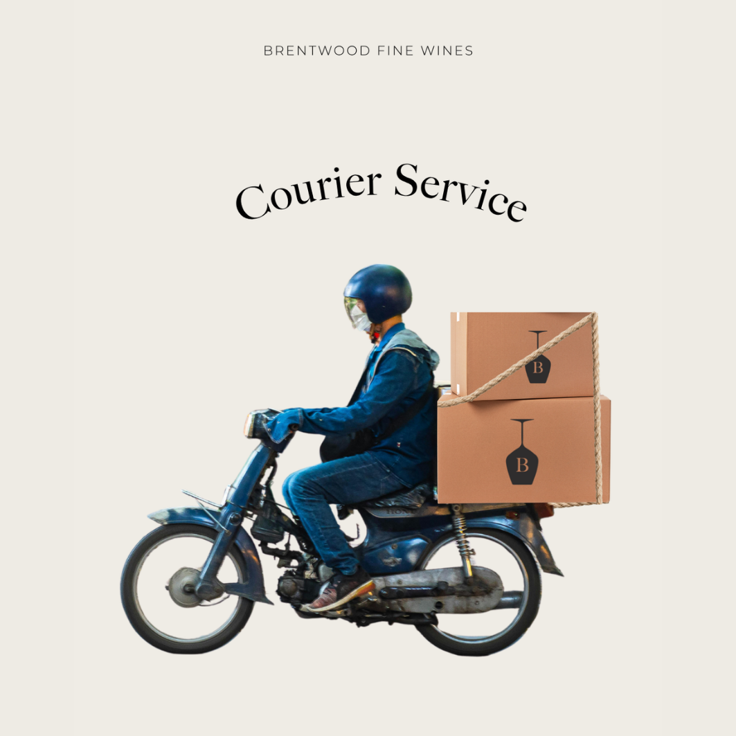
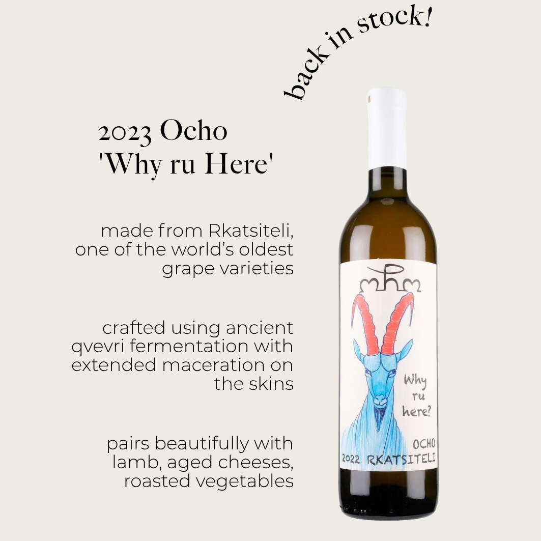
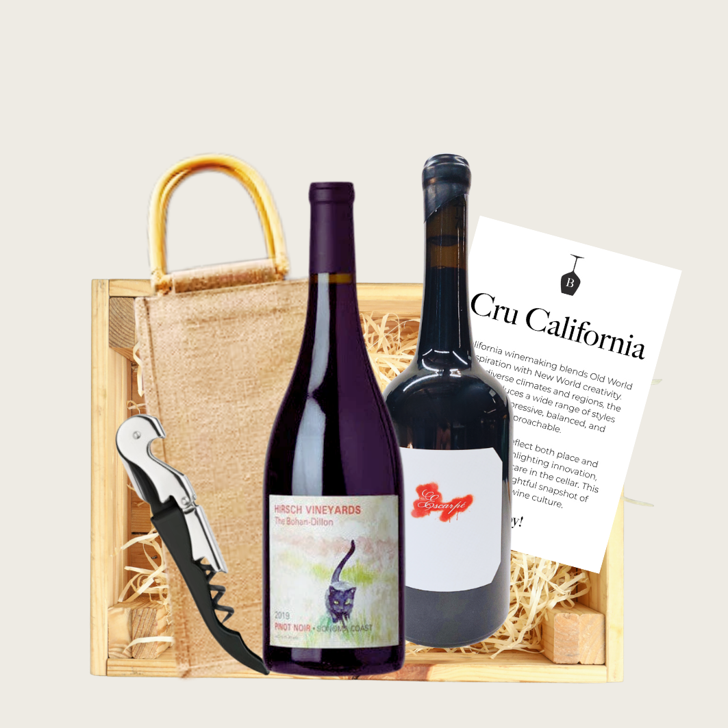
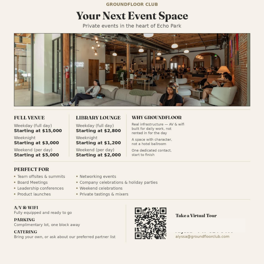
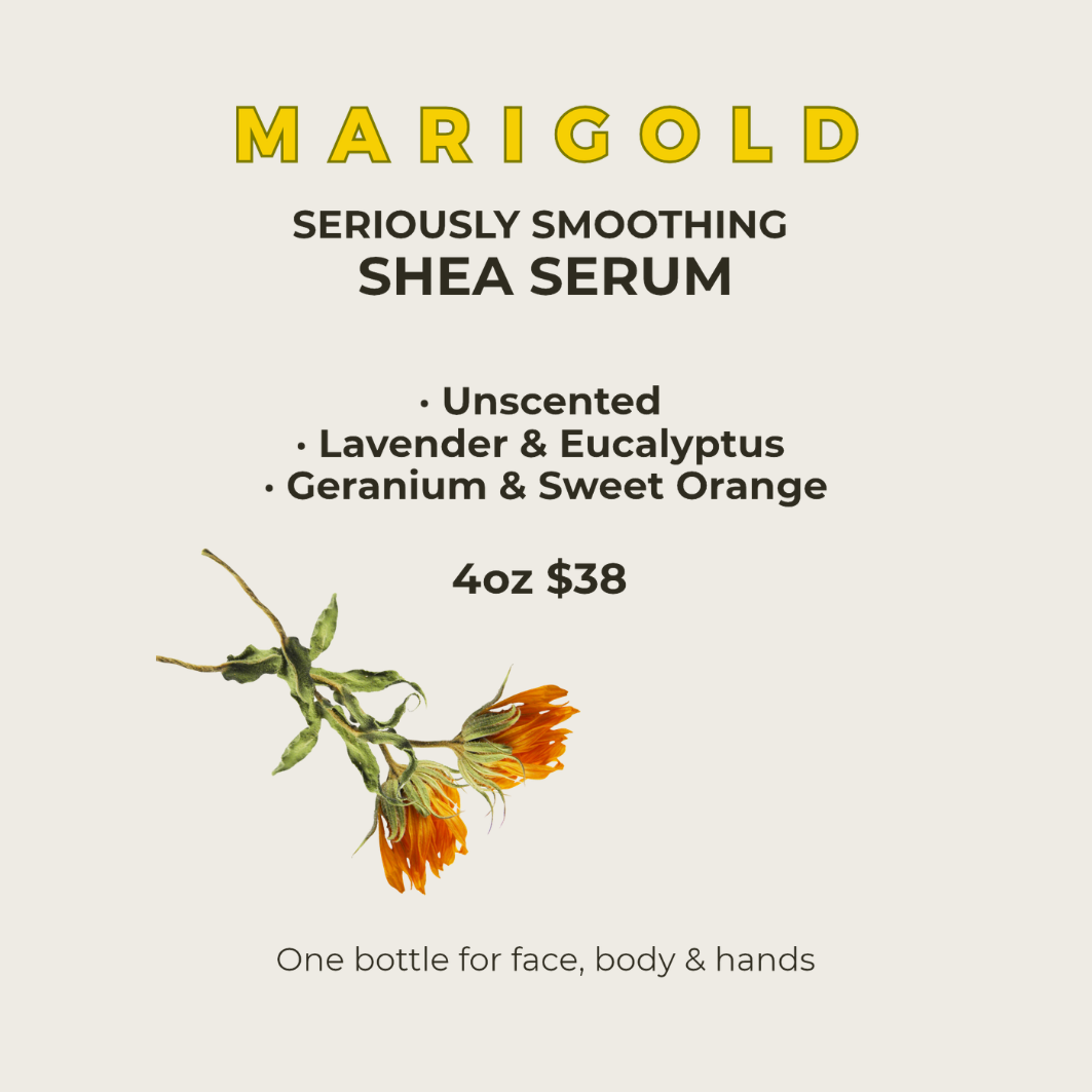
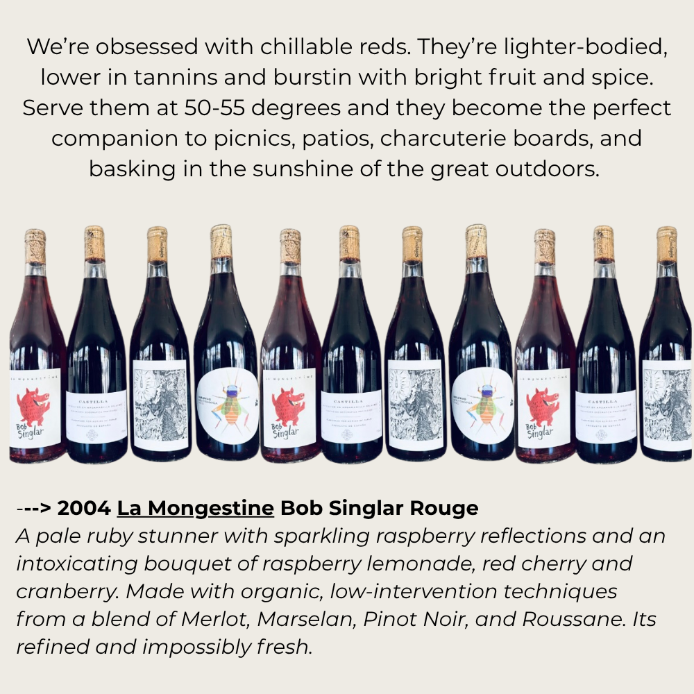
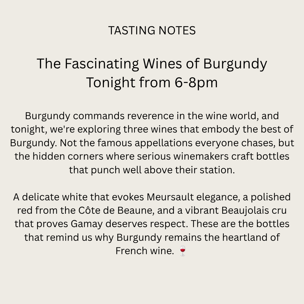
What I did: Designed social graphics and print pieces for Brentwood Fine Wines, including Bottle Night promos, a “Tasting Notes” series, service announcements for courier delivery and gift wrapping, and more. I created a venue one-sheet for Groundfloor Club’s event spaces in Echo Park, and a product card for Marigold’s shea serum. Each piece was built around one clear message, with layouts, type, and imagery chosen to match the tone of the offer.
The result: Materials that range from casual to luxe, but always look like they came from the same place. Bottle Night, promoted weekly with these graphics, sold out nearly every week.
Social Media
Project title: Social Media Strategy & Content
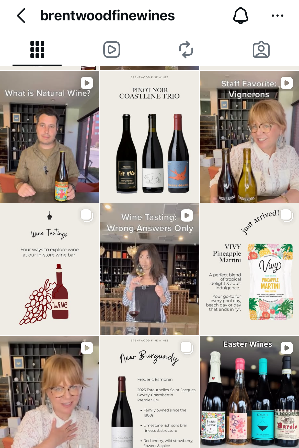
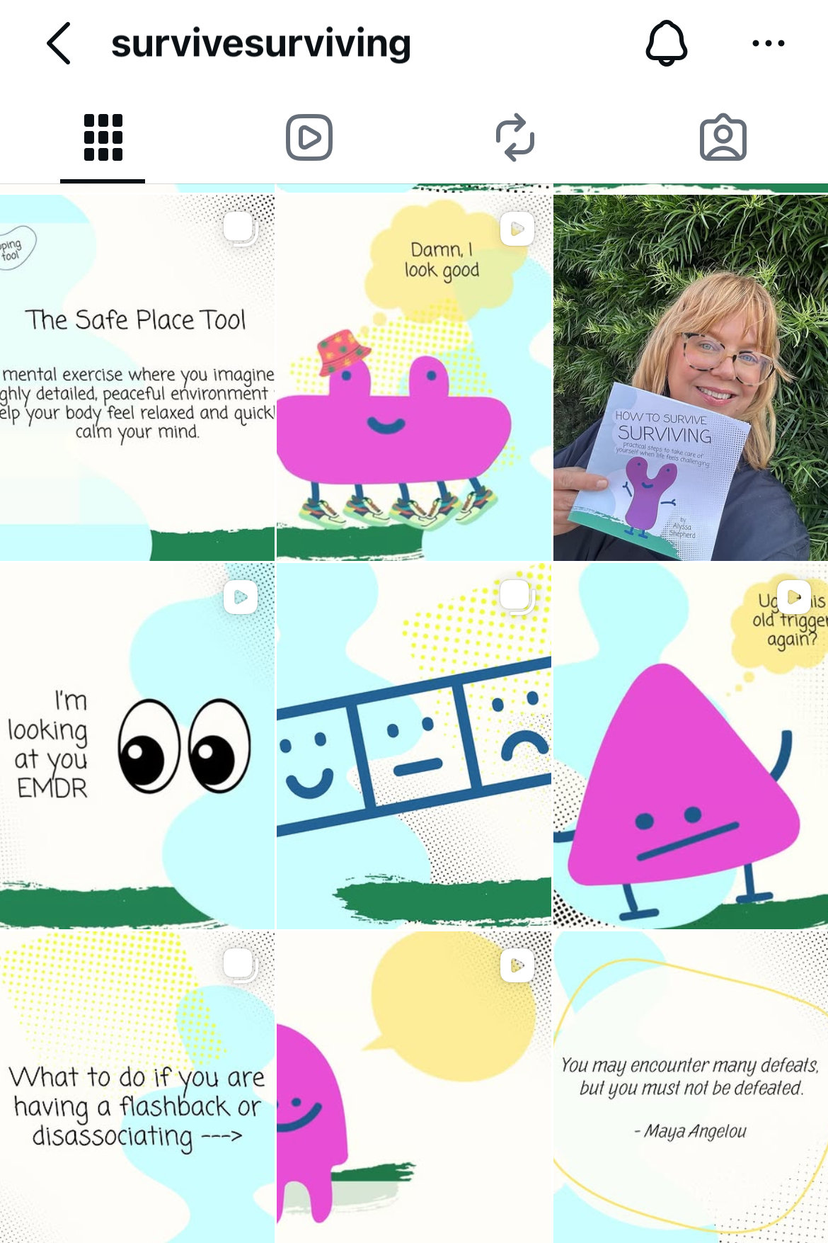
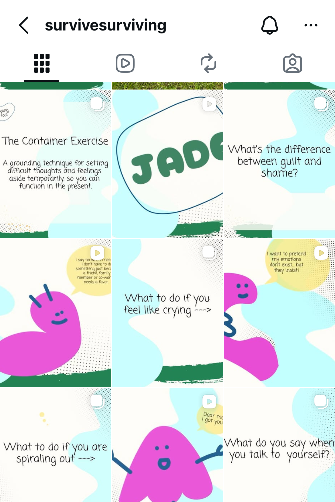
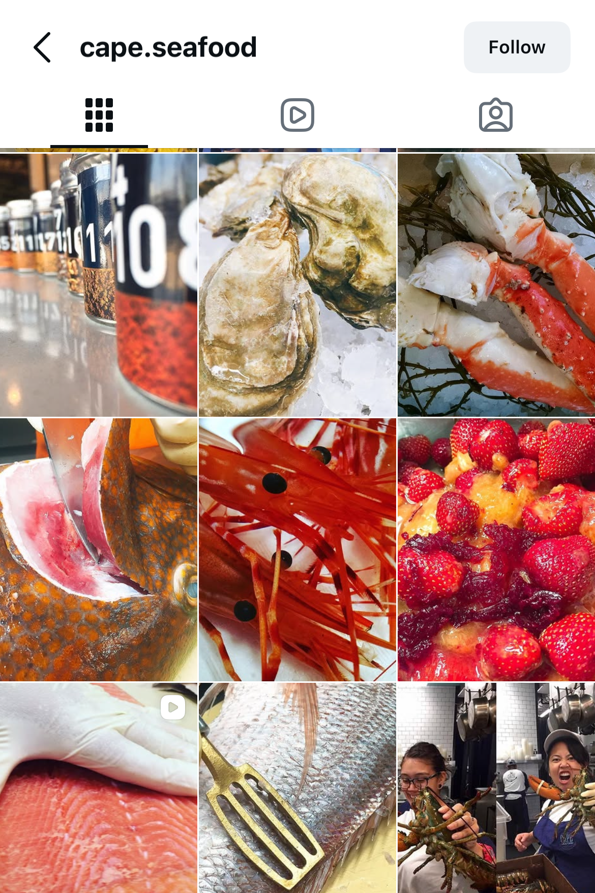
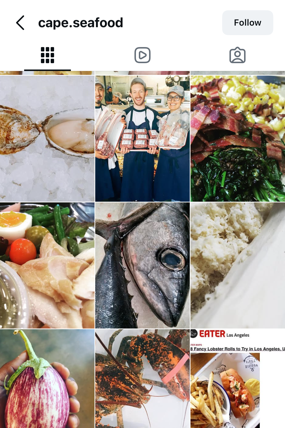
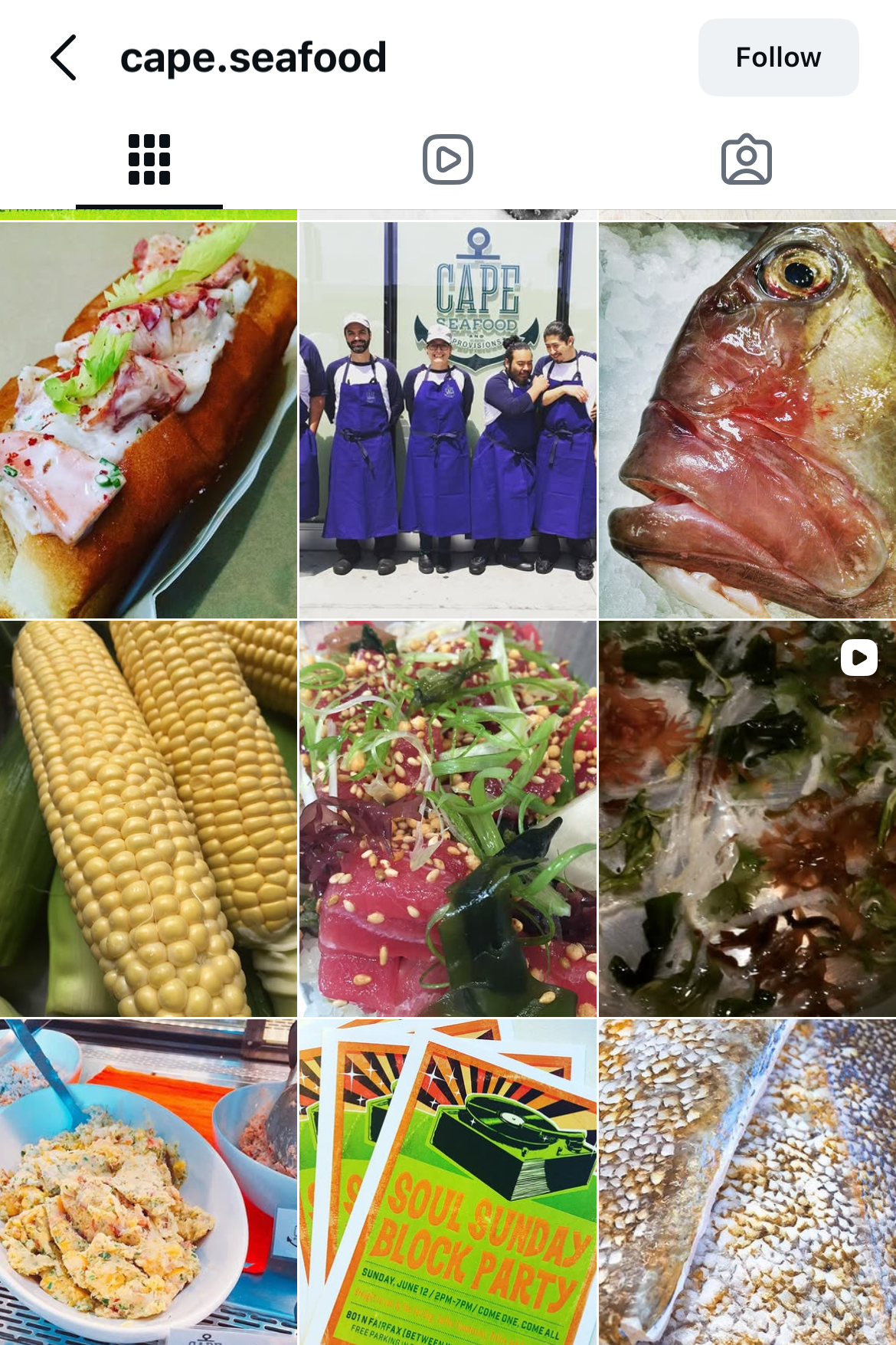
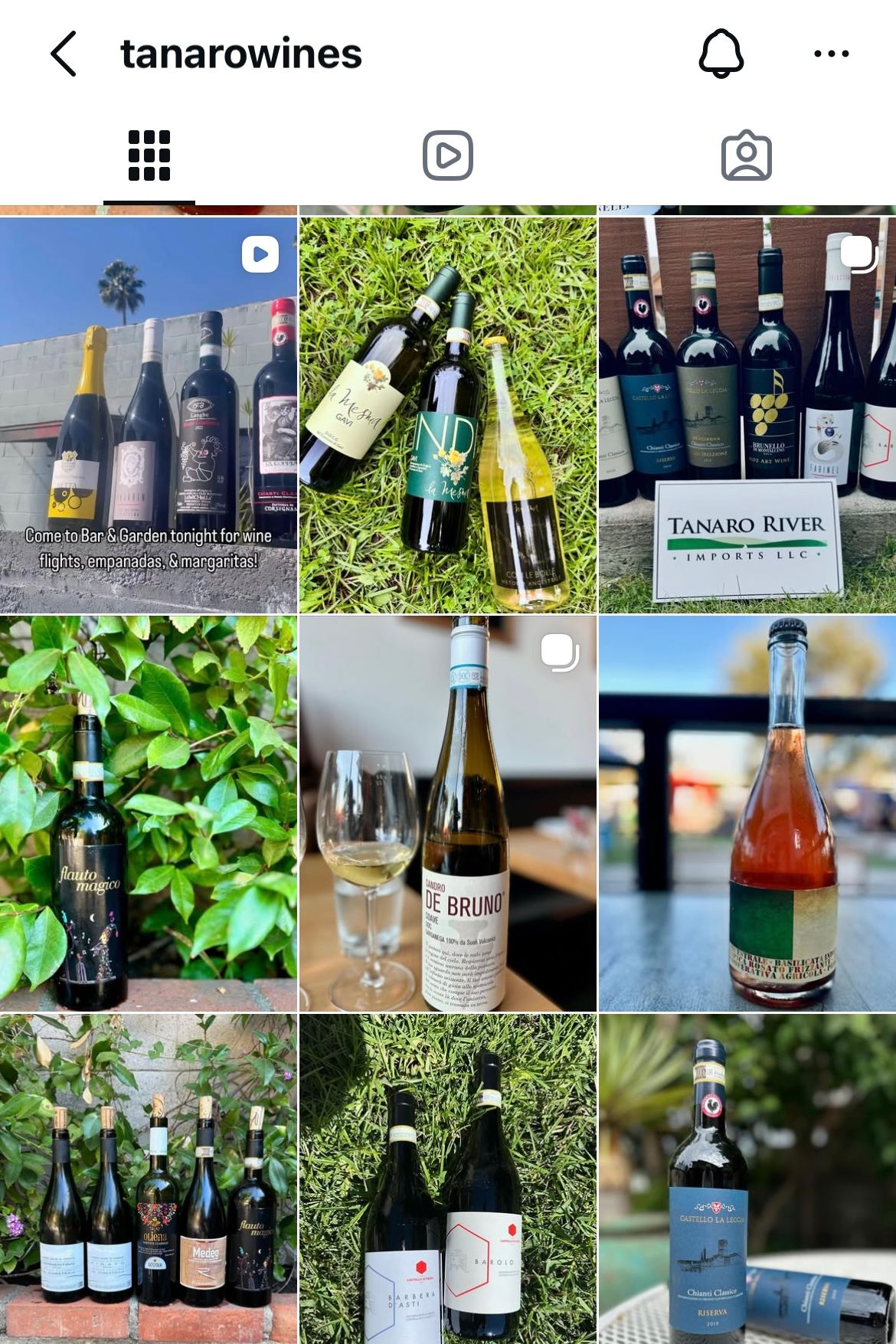
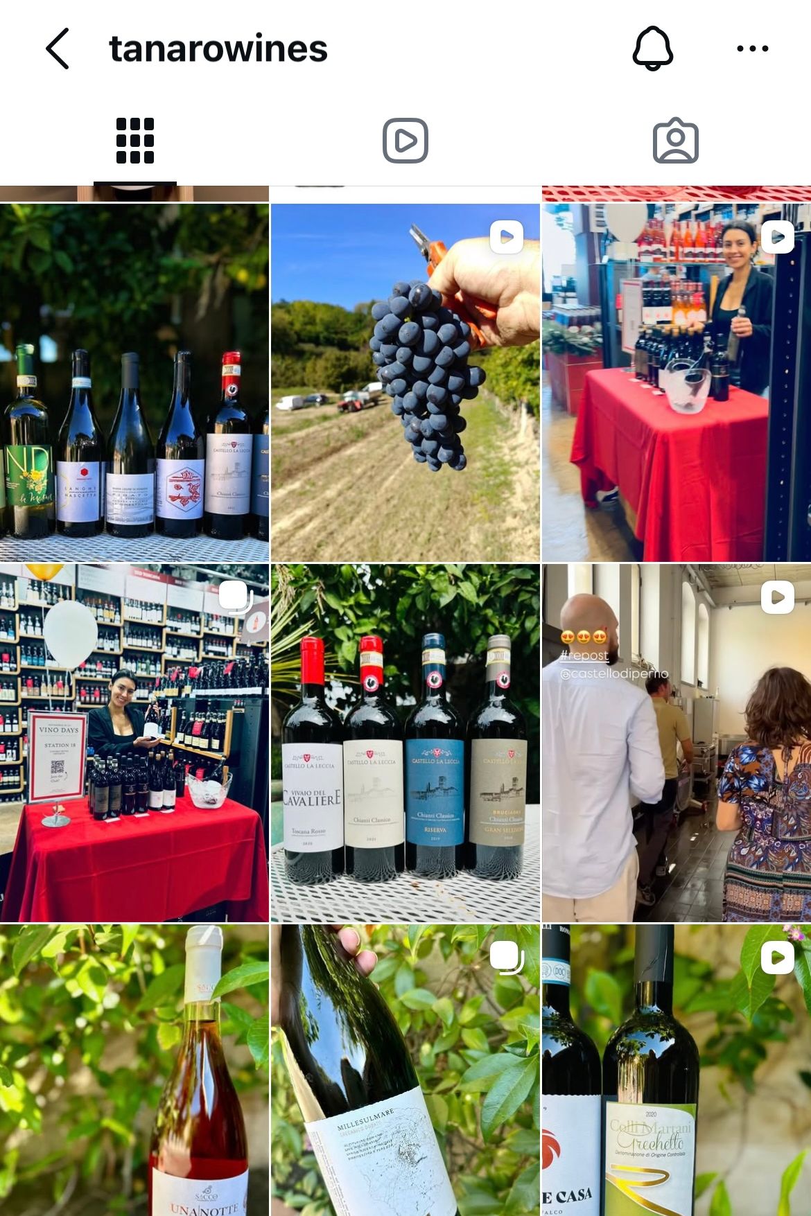
The ask: Four very different brands, each needing a social presence that sounded like itself: a new seafood market building an audience from zero, a wine shop filling weekly events, an Italian wine importer showcasing its portfolio, and my own book, a practical self-help guide.
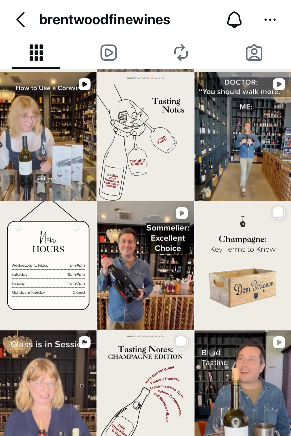
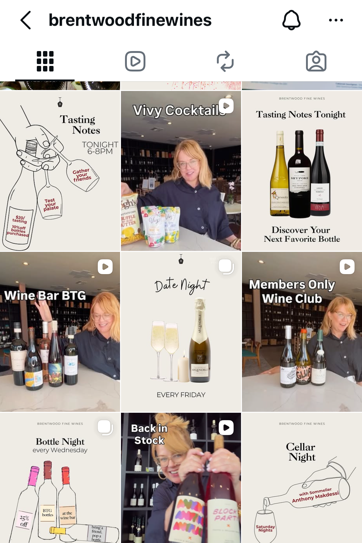
What I did: Ran each account end to end, from strategy and content calendars to graphics, photography, filming, editing, and scheduling. That meant vivid catch-of-the-day photography and behind-the-counter moments for Cape Seafood, recurring event series and on-camera Reels for Brentwood Fine Wines, bright outdoor product shots for Tanaro River Imports, and a playful illustrated look that made coping tools feel approachable for How to Survive Surviving.
The result: Four feeds that look nothing alike: each one is recognizable as its own brand. Cape Seafood grew from zero to 3,000 followers in its first three months, and on Brentwood Fine Wines' feed, weekly promotion helped Tasting Notes sell out nearly every week.
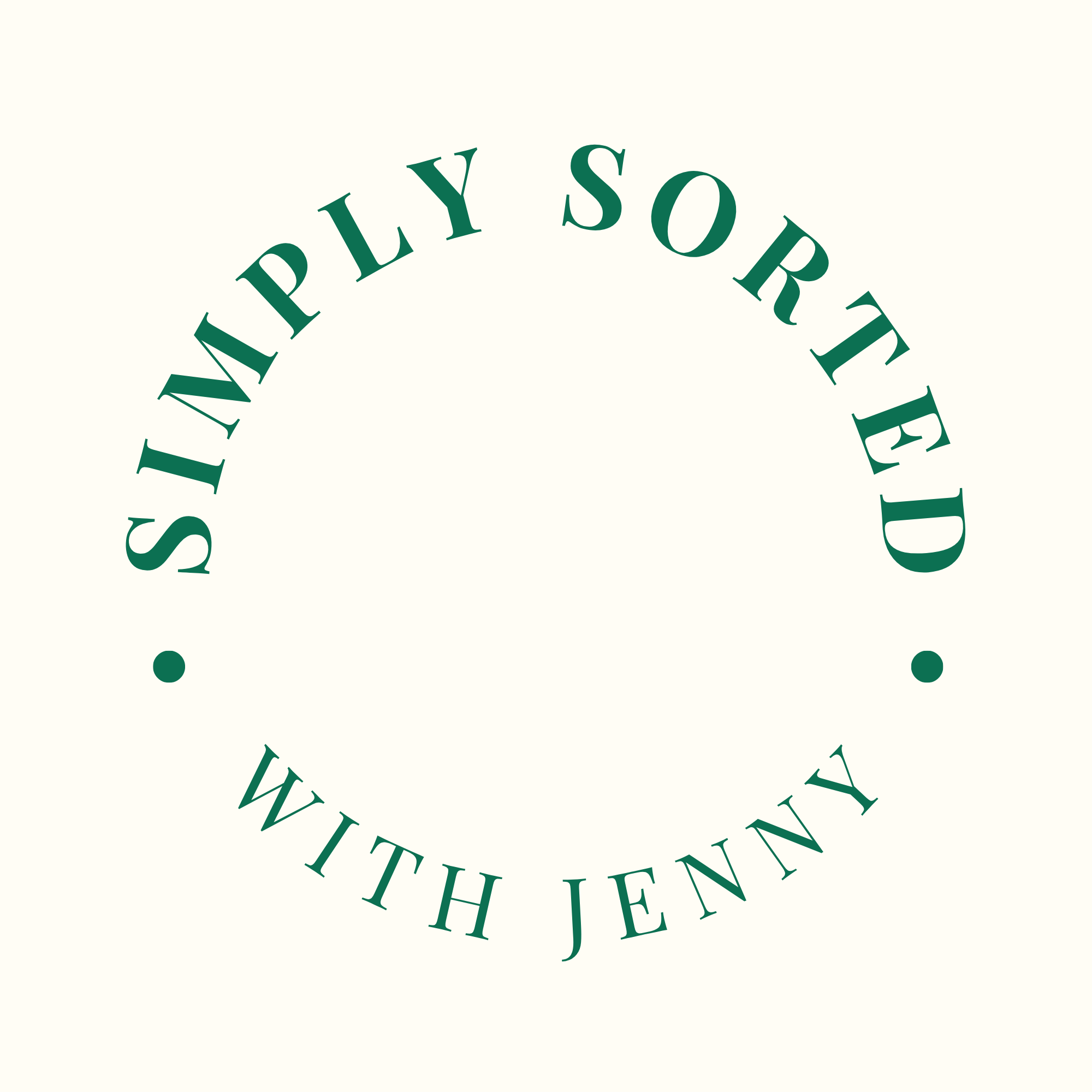
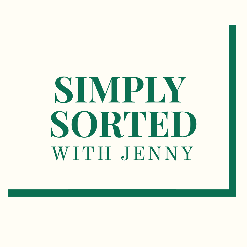
Branding: Simply Sorted with Jenny
Project title: Simply Sorted Logo Design
The ask: A logo for a professional organizer that needed to feel calm and put-together, just like a perfectly organized bin.
What I did: Designed a full logo, circular badge, and submark with a motif that nods to the idea of "sorting" without being literal about it. Chose a serif for warmth and credibility, paired with a crisp green that reads professional but approachable.
The result: A flexible set of marks (full logo, circular badge, and submark) that scales from a website header down to an Instagram avatar without losing its character.
Copywriting
Project title: Copywriting for Wine, Spirits & Luxury Retail
The ask: Wine shops and luxury businesses need copy that makes expertise feel inviting: descriptions that inform and service pages that sound premium.
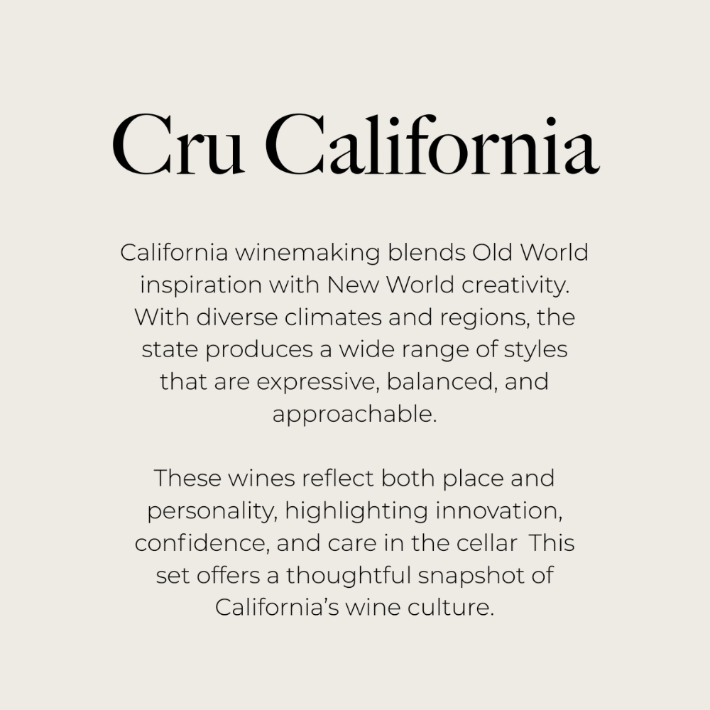
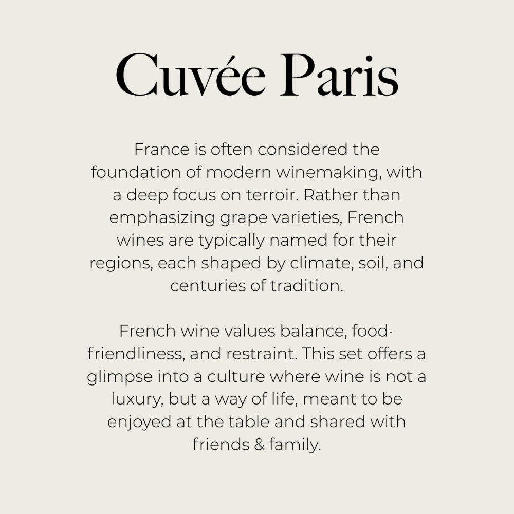
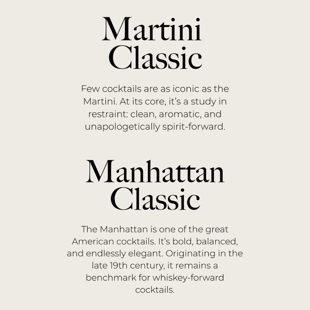
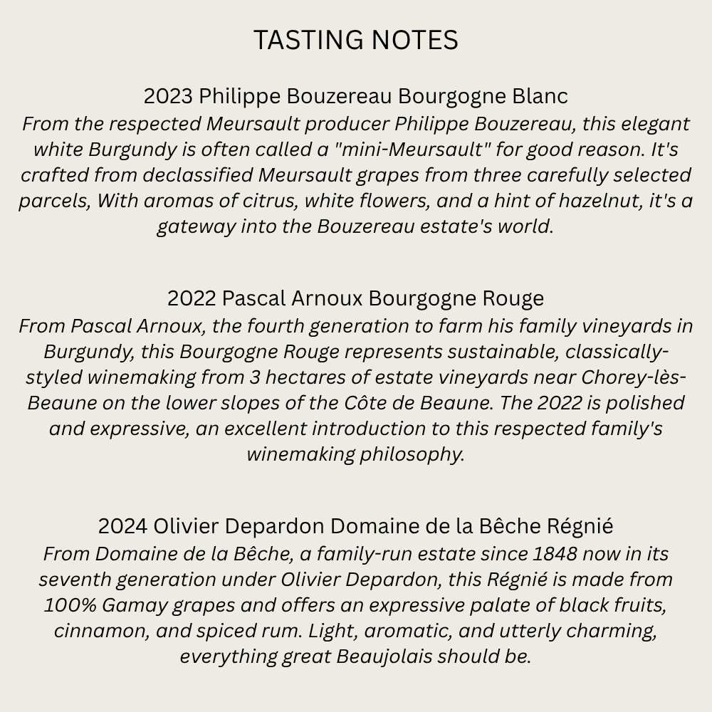
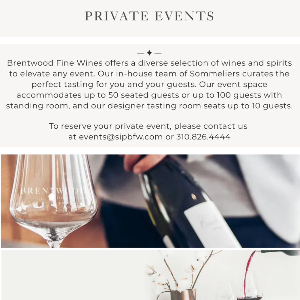
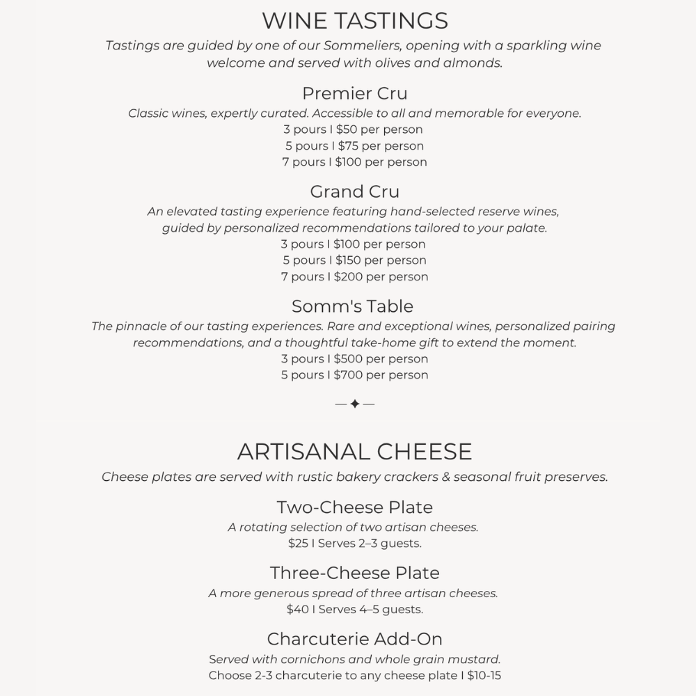
What I did: Wrote tasting notes for weekly events and featured bottles, story-driven descriptions for curated wine gift sets like Cru California and Cuvée Paris, cocktail descriptions, a private events and tasting menu for Brentwood Fine Wines, and service pages for Jacques Jewelers. Each piece balances detail with personality, turning producer history, terroir, and craftsmanship into a reason to buy.
The result: Wine gift set sales rose 25% once the sets had their own page with this copy, and walk-ins at Jacques Jewelers increased 10% after the website refresh.
FAQ
What happens after I contact you?
You’ll get a response in 2-3 business days. I’ll ask you for more details about the project and schedule a call to discuss the details.
How will our collaboration look like?
We’ll start by setting up a plan and timeline that works for both of us. I’ll send you the work in increments for approval.
Can I ask for edits?
Yes! Two rounds of edits are always included in the price. Additional edits are available for an extra fee.
Are you open for a longer contract?
Definitely! I love one-off projects, but I’m all for building meaningful partnerships, and I’m open for retainer contracts.